Inclusive and Accessible Learning Design
Truly effective learning design isn't just about great content—it's about creating experiences where every learner can succeed, regardless of their background, abilities, or learning preferences. Inclusive and accessible design isn't an add-on or afterthought; it's a fundamental approach that makes learning better for everyone.
My approach to inclusive design goes beyond compliance to embrace the full spectrum of human diversity—considering not just accessibility needs, but also cultural backgrounds, neurodiversity, language differences, and varying levels of prior knowledge. It's about asking "Who might we be inadvertently excluding?" and then designing solutions that open doors rather than create barriers.
This isn't just good practice—it's good business. Inclusive learning experiences reach more learners, reduce support needs, and create environments where everyone can contribute their best thinking. When learning is accessible to all, everyone wins.
Many of these standards have been adapted specifically for Learning Experience Design from ada.gov and the W3C Web Accessibility Initiative.
Each area presents a list of tips, questions to ask yourself about your design, and resources to create more inclusive & accessible design. By using this document, you will become more attuned to the needs of your learners, allowing you to design a more accessible user experience for all. These standards apply to slide decks, videos, eLearning, documentation, job aids, web pages, and other deliverables.
Table of Contents
The questions provided under each topic are a tool to help you understand what problems may arise. You should always test your content with learners to ensure it’s usable and accessible to them.
Animation & Effects
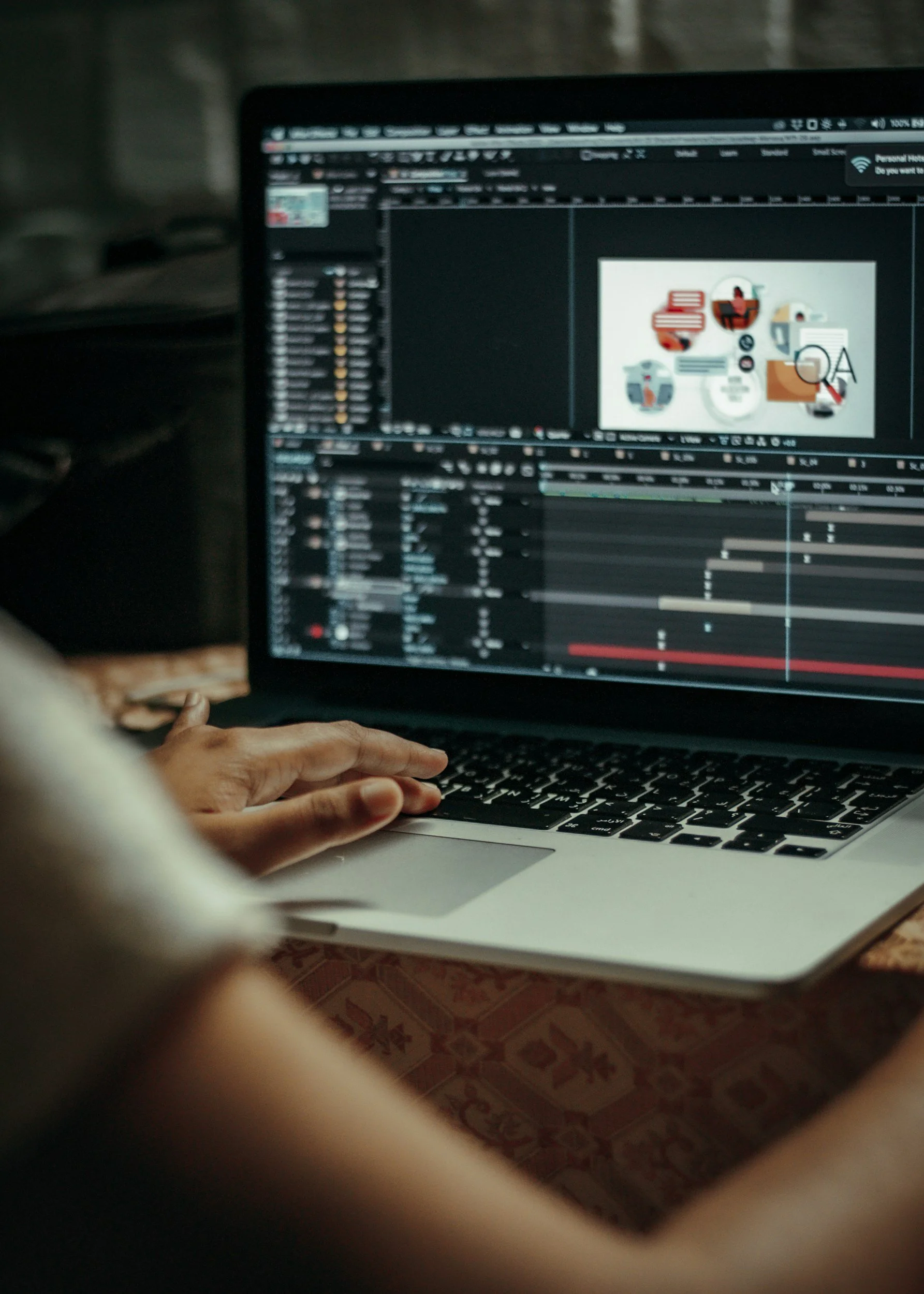
Effective animations can bring your content to life, guide learners’ focus, and orient them. But animations are a double-edged sword. Not only can misusing animations cause confusion or be distracting, but they can also induce seizures for some learners.
Tips for animation design:
Cover small distances relative to the size of the viewport.
For example, avoid animations that traverse the screen from one side to the other.
Match direction and speed of other moving objects (including scroll).
Avoid animations that take up a large portion of the screen.
Learn how to design safer animations.
To use animation in an inclusive way, ask yourself these questions:
Are there any flashing or shaking effects that could cause a seizure?
Are there any animations or effects that could cause dizziness or vertigo through use of motion?
Are there any animations that could be distracting by constantly moving, blinking, or auto-updating?
Is it possible to provide controls or options to stop, pause, hide, or change the frequency of any animations or effects?
Audio & Video
Autoplaying videos and audio on a web page or in an eLearning can be annoying. They break a learner’s concentration, and force the learner to hunt down the offending media and mute or stop it. Always provide controls or options to pause or disable the video. Along with controls, videos must always have transcripts and/or closed captions and subtitles (providing both is preferred) so learners can consume the content in a way that works best for them.
Tips for audio/video design:
Don’t autoplay media.
Provide controls or options to pause or disable media.
Provide a transcript, closed captioning, and subtitles.
Use a tool like rev.com to transcribe your audio content for closed captions and translate subtitles for videos that will be embedded into Articulate.
To use audio and video in an inclusive way, ask yourself these questions:
Is there any audio or video that could be annoying by autoplaying?
Is it possible to provide controls to stop, pause, or hide any audio or videos that autoplay?
Do videos have transcripts and/or closed captions and subtitles?
Color
Color plays an important part in the visual aspects of our learning experiences. Colors evoke emotions, feelings, and ideas. They can also strengthen your brand and perception of your work. Yet the power of colors is lost when our learners can’t see them, or when they perceive them differently. Color blindness affects roughly 1 in 12 men and 1 in 200 women. Deuteranopia (red-green color blindness) is the most common form of color blindness, affecting about 6% of men.
Simulation of Color Blindness
Additionally, colors mean different things in different countries and cultures. In Western cultures, red is typically used to represent negative trends and green positive trends, but the opposite is true in Eastern and Asian cultures.
Tips for color in your design:
Avoid high concentrations of saturated color, high contrast color, and yellow.
Ensure at least 4.5:1 luminosity contrast between text and background. That means that if the visual material were all turned to shades of gray, there would still be sufficient contrast to distinguish all elements (see luminosity checker below).
Always use a non-color identifier in your design. For example, pair color with text and/or a graphic indicator. Instead of a green dot and a read dot, have a green check with a positive word and a red X with a negative word.
To use color in an inclusive way, ask yourself these questions:
If the color was removed from the design, what meaning would be lost?
Could I provide meaning without using color?
Are any colors oversaturated or have high contrast that could cause learners to become overstimulated or uncomfortable?
Does the foreground and background color of all text, icons, and focus indicators meet contrast ratio guidelines of 4.5:1? (Use the color luminosity contrast checker: https://coolors.co/contrast-checker/ or the colorblindness simulator: https://colorific.darrellhanley.com/)
If I have put text over images, is there enough contrast to meet the the guidelines? Use this tool to specifically check text over images: https://www.brandwood.com/a11y/. Please note that it is not considered a best practice to put text over an image, and certainly not text in an image.

Images & Icons
Images can be used in a design to convey a specific meaning or feeling. Other times they can be used to simplify complex ideas. Whichever the case for the image, a learner who uses a screen reader needs to be given a description of the image either as a caption, alt text, or audio description.
Tips for using images in your design:
Descriptions should be succinct. It’s recommended to use no more than two sentences, but aim for one concise sentence when possible. This allows users of screen readers to quickly understand the image without having to listen to a lengthy description.
If the information of the image would require a lengthy description, such as a complex chart, don’t put that description in the alt text. Instead, use a short description for the alt text and then provide the long description as either a caption or link to a different page.
To use the images and icons in an inclusive way, ask yourself these questions:
Does any image contain information that would be lost if it was not viewable?
How could I provide the information in a non-visual way?
Font
Font sizes must be responsive to the viewing device. Not only that, but the content design should be flexible enough to allow learners to customize the font size, line height, or letter spacing to a comfortable reading level using any number of plugins they may have installed. Fonts themselves should be easy to read.
Tips for font in your design:
Larger text.
More space between lines (but not too much).
Increased letter spacing (but not too much).
Avoid decorative or cursive font styles, small font sizes, italicized text, and all uppercase text.
Use familiar fonts where all characters are distinct. For example 1, l and I should all look different.
To use the fonts in an inclusive way, ask yourself these questions:
Is the design flexible enough that the font could be modified to a comfortable reading level by the learner?
Is the font style easy to read?
Read more about the impact of typography on readability.

Layout
Having a layout that is easy to follow with easy to find content makes all the difference to your learner. As a learning experience designer, you need to know how a screen reader interacts with the HTML elements (like attributes and tags) on a page so you know how to enhance learners’ experience.
Tips for supporting a cohesive layout in your design:
Make the different parts of a page easy to locate and identify. This includes navigation menus, links, and text sections. These should be at predictable locations and consistently identified.
Form labels and instructions are clearly associated with their controls.
Use HTML elements in your layouts in meaningful, helpful ways, if appropriate.
The layout should be resizable and flexible to a minimum of 320 pixels with no horizontal scroll bars so that it can be viewed comfortably on a phone, if creating a webpage or Articulate module.
The layout should also be flexible enough to be zoomed in to 400% (also with no horizontal scroll bars) for learners who need to increase the font size for a better reading experience, if creating a webpage, Articulate module, or other online experience.
To use the layout in an accessible way, ask yourself these questions:
Does the layout have a meaningful and logical sequence?
What should happen to the layout when it’s viewed on a small screen or zoomed in to 400%?
Is content that is related or changes due to user interaction in close proximity to one another?
Learn more about layout and accessibility.
Readability
Sentence length, paragraph length, and complexity of language all contribute to how readable the text is. Complex language can pose problems for learners, especially those with cognitive disabilities or who are non-native speakers of the language.
Another contributor to the readability of content is the measure (length of a line of text). The ideal measure is often quoted to be between 45 and 75 characters or 7-10 words. A line that is too long causes learners to lose focus and makes it harder to move to the next line correctly, while a line that is too short causes learners’ eyes to jump too often, causing fatigue on the eyes.
Break up the content with headings, lists, or images to give mental breaks to the reader, make it scannable, and support different learning styles. Headings, links, controls, and labels should be clear and descriptive to enhance learners’ ability to comprehend.
Tips for supporting readable text in your design:
Plain, simple language.
One idea per paragraph.
Headings logically grouping and summarizing information.
Shorter measures (7-10 words per line).
To make content readable, ask yourself these questions:
Is the language plain and simple?
Does each paragraph focus on a single idea?
Are there any long paragraphs or long blocks of unbroken text?
Are all headings, links, controls, and labels clear and descriptive?
Are the lines of text too long?
Keyboard & Alternative Devices
Keyboard & alternative device accessibility is among the most important aspects of an accessible learning experience. Learners will use devices other than a mouse to access your content. There are many reasons why a learner would use one of these devices instead of a mouse. Most commonly, learners are using their keyboards, but they may also be using mouth sticks, head pointers, switches, voice recognition software, or alternate keyboards.
Tips for supporting alternatives devices in your design:
A logical order for the tab order really helps learners know where the next key press will take them. In western cultures, this usually means from left to right, top to bottom.
Minimize number of tabs, as a learner using their keyboard must tab through all controls that are before the one that they want.
To use the keyboard or alternative device controls in an accessible way, ask yourself these questions:
What keyboard navigation order makes the most sense for the design?
How could a keyboard user get to what they want in the quickest way possible?
Is the focus indicator (the highlighted box that moves from control to control as users tab through them) always visible and visually distinct? (Most of the authoring tools we have available do not allow us to customize the focus indicator, but if this is available to you, ask yourself this question.)
Read more about alternative input devices.
Controls

Controls, also known as interactive content, are any elements that learners can interact with, be they buttons, links, accordions, drag-and-drops, hot spots, flashcards, etc. Controls that are too small or too close together can cause lots of problems for learners.
Tips for controls in your design:
To give learners enough room to accurately select a control, the WCAG spec recommends at least 44 by 44 pixels. This size also includes any padding the control has. So a control could visually be 24 by 24 pixels but with an additional 10 pixels of padding on all sides would bring it up to 44 by 44 pixels.
Controls need to be placed far enough apart to reduce touch errors. Google recommends controls be spaced at least 32 pixels apart.
Controls should also have a visible text label. Not only do screen readers require the text label to know what the control does, but it’s been shown that text labels help all users better understand a control’s purpose. This is especially important for form inputs and icons.
Don’t make people hover to find things.
If you are creating a hyperlink, ensure this link is accessible.
To use controls in an inclusive way, ask yourself these questions:
Are any controls not large enough for someone to touch?
Are any controls too close together that would make it easy to touch the wrong one?
Are there any controls inside another control or clickable region?
Do all controls have a visible text label?

Time
Sometimes in a learning experience, you may need to limit the amount of time a learner can spend on a task. You should understand that some learners may need more time in order finish a task. Some might need more time to understand the content, others might not be able to perform the task quickly, and a lot of the time, they could just have been interrupted by something in their environment.
Tips for supporting time flexibility in your design:
Learners who need more time to perform an action should be able to adjust or remove a time limit when possible. For example, with a timed quiz, you could alert the learner when the quiz is about to close and allow them to extend the time.
To use time in an accessible way, ask yourself this question:
Is it possible to provide controls to adjust or remove time limits?
Material Honesty
When applied to web design, material honesty means that one element or component shouldn’t look, behave, or function as if it were another element or component. Links and buttons have different behaviors and affordances. Where this becomes the most problematic is when a link and button are styled the same and are placed next to one another. As there is nothing to differentiate between the two, a learner can accidentally navigate when they thought they wouldn’t. A classic example of material dishonesty in the instructional design world is when an image of a video looks like it has a play button on, but is in fact a link that opens in a new window to play the video from there.
To use the materials honesty, ask yourself these questions:
Is the design being honest to the learner?
Are there any elements that behave, look, or function as another element?
Are there any components that combine distinct behaviors into a single component?
Does doing so make the component materially dishonest?
Global Inclusivity
Another important form of inclusivity is to ensure that your content is relevant to all of your global learners. Representation, using diverse subject matter experts and content contributors, and inclusive nomenclature are all important features to include in your design.
Tips for supporting global inclusivity in your design:
When looking for images of humans, use photos of:
All skin tones.
All abilities.
All religious wear.
All ages.
All genders & gender expressions.
Use global names when creating scenarios.
Use inclusive third-person pronouns—gender is not a binary! There are many third-person pronouns that you can use in your design, including:
They/Their/Theirs
Ze/Zir/Zirs
Hir/Hir/Hirs
He/Him/His
She/Her/Hers*
Create an inclusive advisory group to drive and inform your design. To learn how to identify and maintain a diverse advisory group, use these Inclusive SME Selection Guidelines.
*Note that this is not a comprehensive list.
DEMOGRAPHIC CHECKLIST
Races / Ethnicities: African/Black, Hispanic, Asian, Middle Eastern, Caucasian/white, mixed-race, among others
Genders: Women, men, transgender, non-binary, and other genders Ages: A range of ages from birth to old age
Abilities: People with a wide array of different physical and mental abilities or disabilities
Body Types: A range of body types, sizes, and heights
QUESTIONS TO ASK ENSURE YOU ARE BEING INCLUSIVE
Who is missing or excluded?
Can any photos be swapped out for a different type of person?
Would I want to be portrayed this way? If this was a photo of me or someone I love, would I be okay with how they are represented?
Are any stereotypes being perpetuated in the photo I am using? Am I depicting someone in the role our culture typically puts them in, or am I making a more unexpected choice?
Can everyone who might view the photo see someone like themselves represented in it?
DIVERSE & INCLUSIVE STOCK PHOTO WEBSITES
TONL: Find culturally diverse stock photos that help to more accurately represent the world we live in.
Picnoi: “Free Stock Photo for a Colorful World“
WOCinTech (Via flickr): Stock photos of women of color in tech
Rawpixel: Senior photos to express a variety of ages from one of the most diverse stock photo sites in the industry.
Photo Ability: It represents one billion persons with disabilities from all over the world
Body Liberation Photos: For body size diversity that reflects the diverse array of people we see around us everyday